REDESIGN CONCEPT FOR MUJI.US
—
OBJECTIVE: To bring Muji’s unique and well-loved in-store experience to their US ecommerce site.
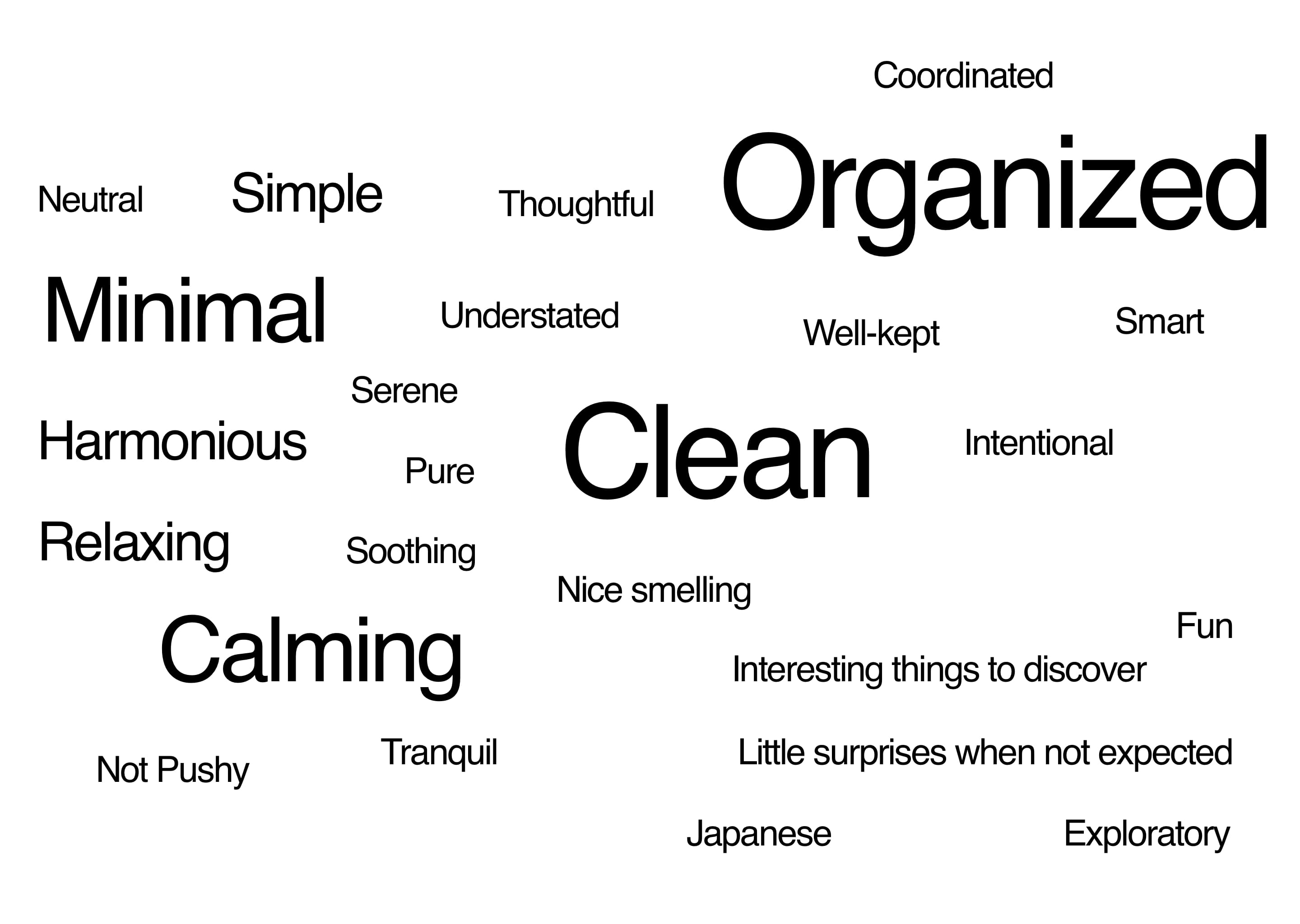
CUSTOMER INTERVIEWS
Muji store customers were interviewed and asked to give several words that represent their experience shopping in Muji’s physical stores. The image below represents their responses: the largest words represent the most responses.
MOOD BOARDS
Mood boards were created using imagery from Muji to represent the main characteristics that customers associated with Muji’s in-store experience, and to set the style for the web design.
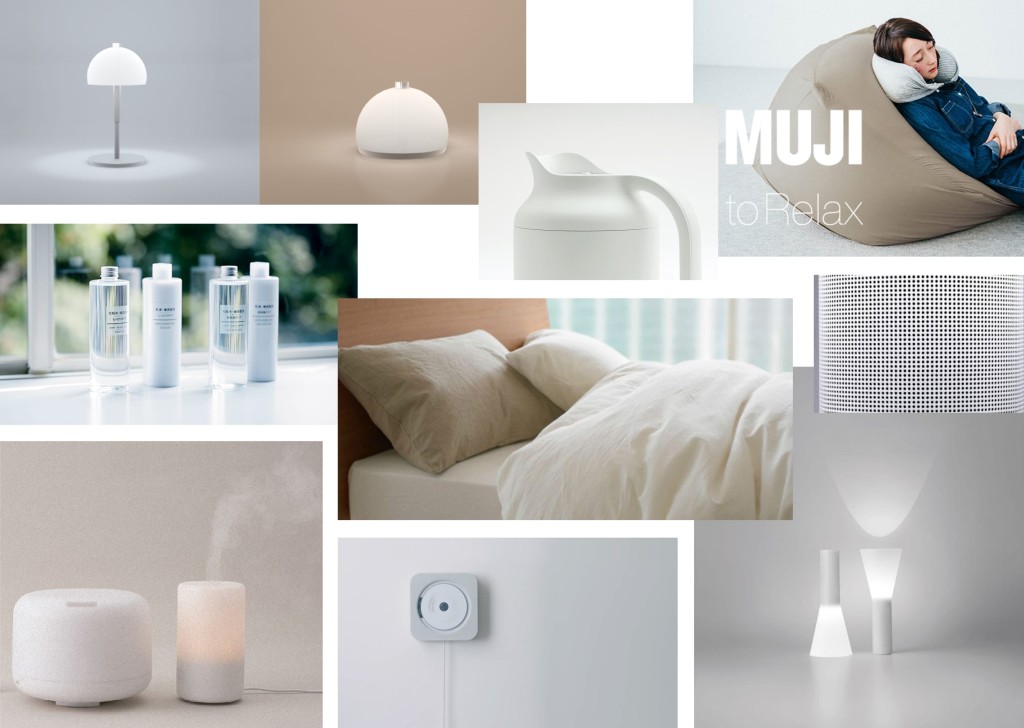
Minimal Calm
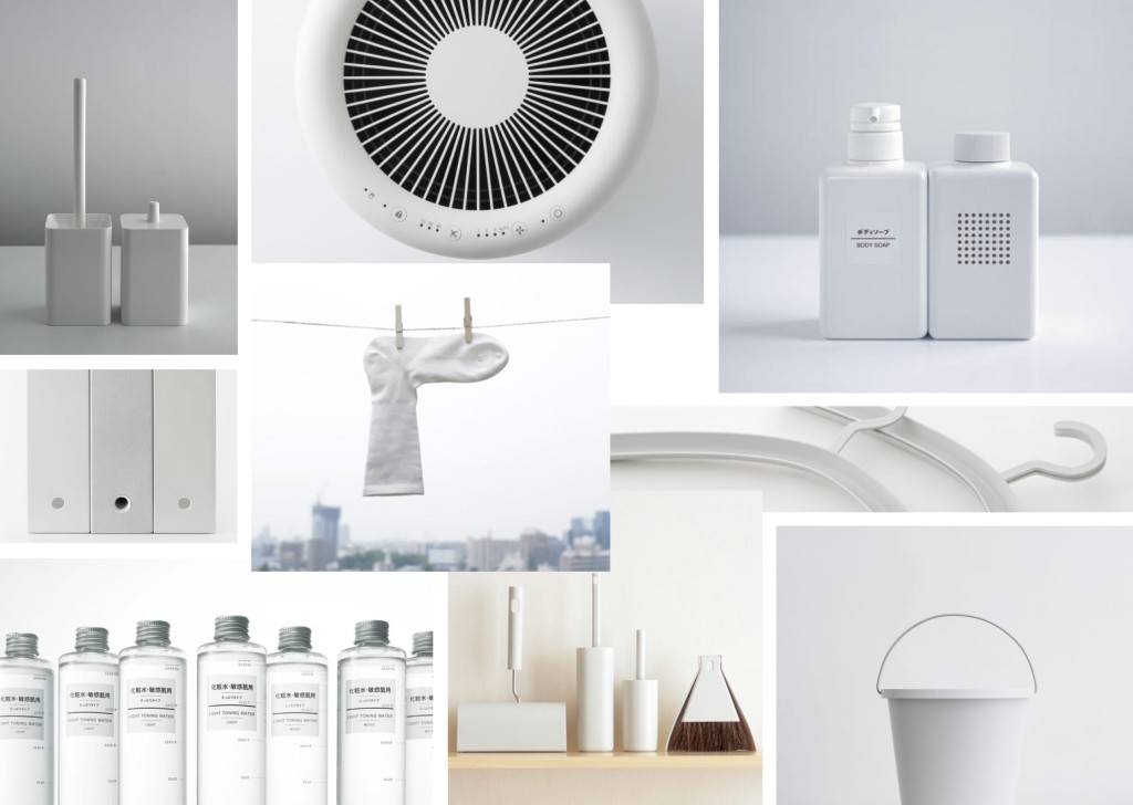
Minimal Clean
CURRENT US SITE
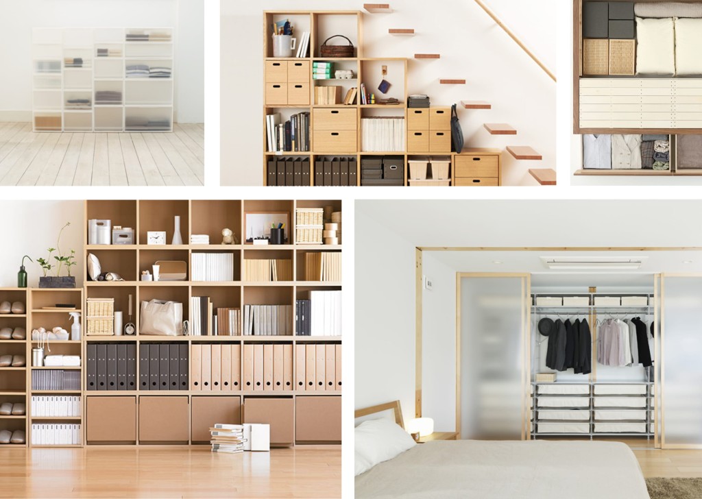
Minimal Organized
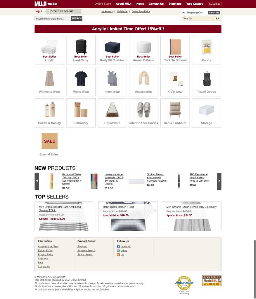
Home page is overly cluttered and overwhelming. There are too many primary categories. The colors used work for much of their product packaging, but do not translate well to the web.
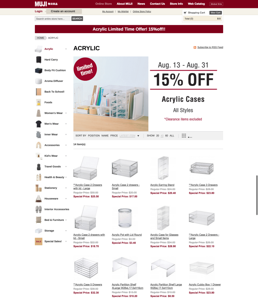
Product category pages are cluttered. The promotional message is very “loud” and does not fit with the brand aesthetic.
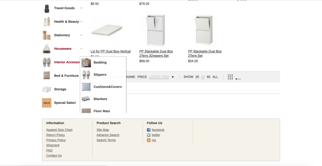
The sidebar menu is not functional, items lower down get cut off.
Many product and category names (such as “dust boxes” and “homewear” seem to be a direct translation from the Japanese name, and not recognizable to the English-speaking customer.
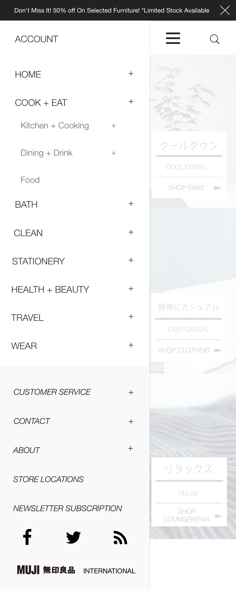
INFORMATION ARCHITECTURE
It was equally important the the information architecture of the re-designed site was also as minimal, calm, clean and organized as possible. The current site does not reflect these values at all, and it is near impossible to find many items on the site.
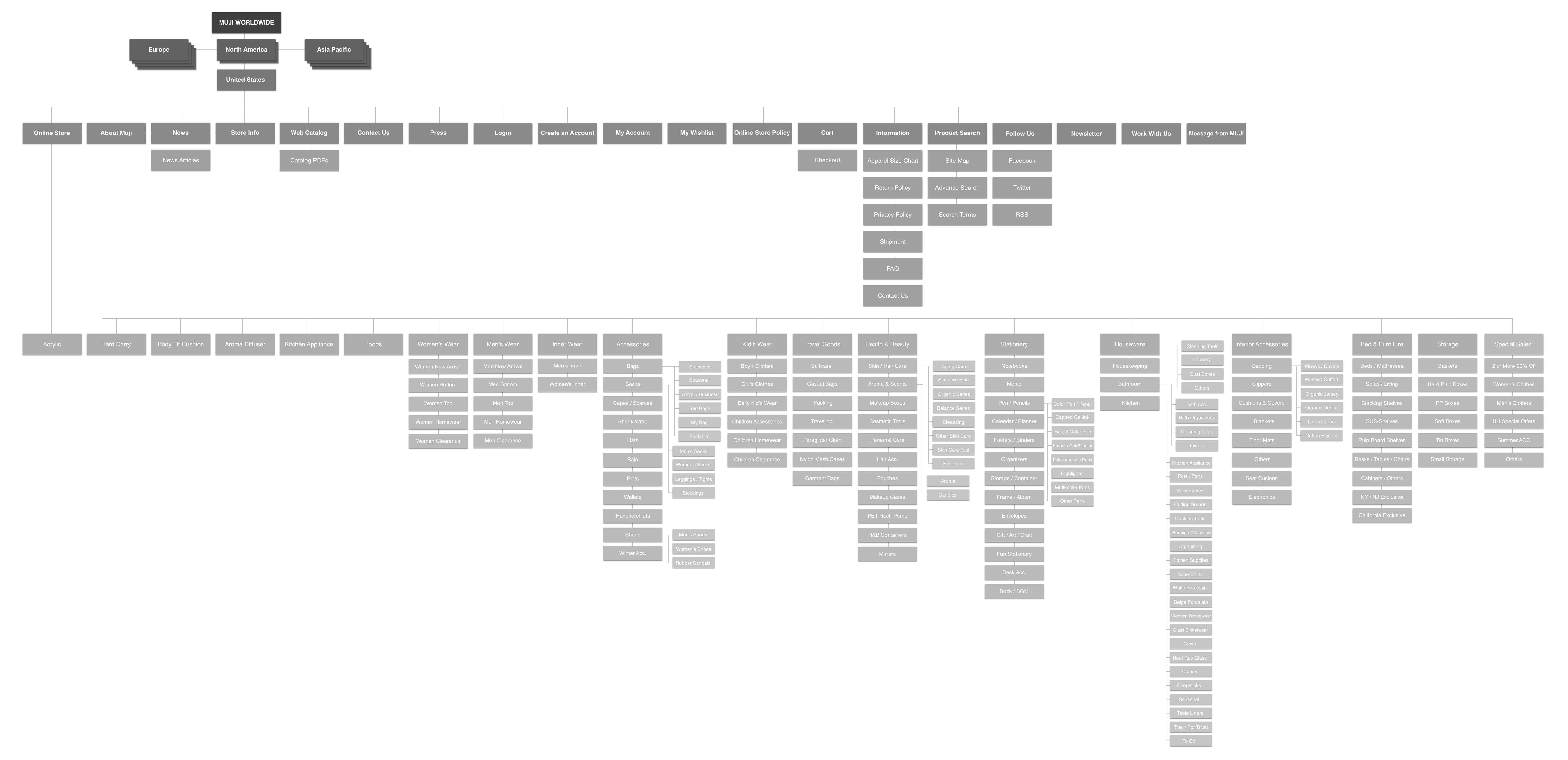
CURRENT SITEMAP
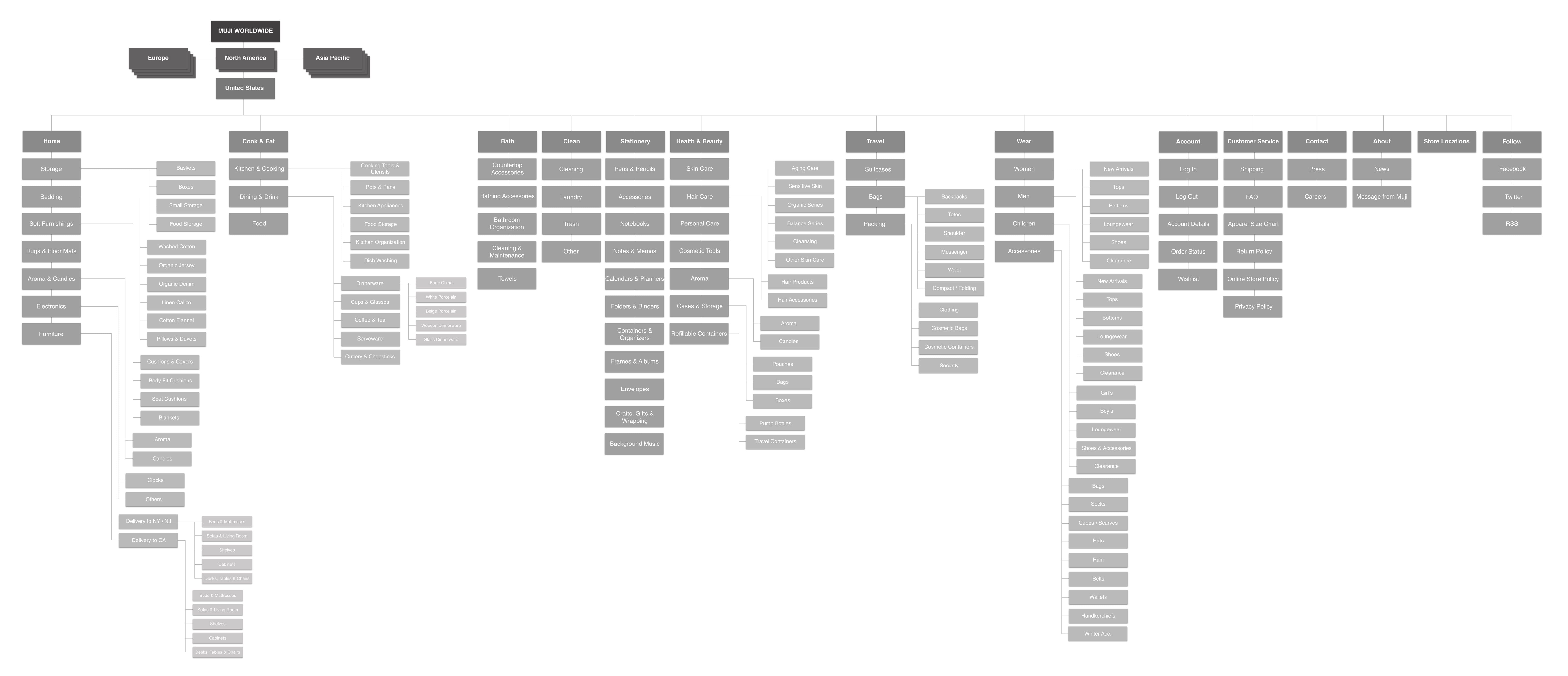
PROPOSED SITEMAP
The current top level of the current site was completely removed; customers are now directed straight to the e-commerce site. Some pages, such as “Product Search” and “Web Catalog” were deemed unnecessary for the re-designed site, and were removed. Many pages (such as policies etc.) which were previously included in the main menu, were moved to the footer.
A review of all products was conducted, and categories were completely re-worked. Many previous categories were removed, and new ones were added. Primary categories were named for simplicity, such as “Clean” rather than “Cleaning Products”. The new structure makes it easier to find items.
WIREFRAMING
The main pages were wireframed to determine the structure and layout.

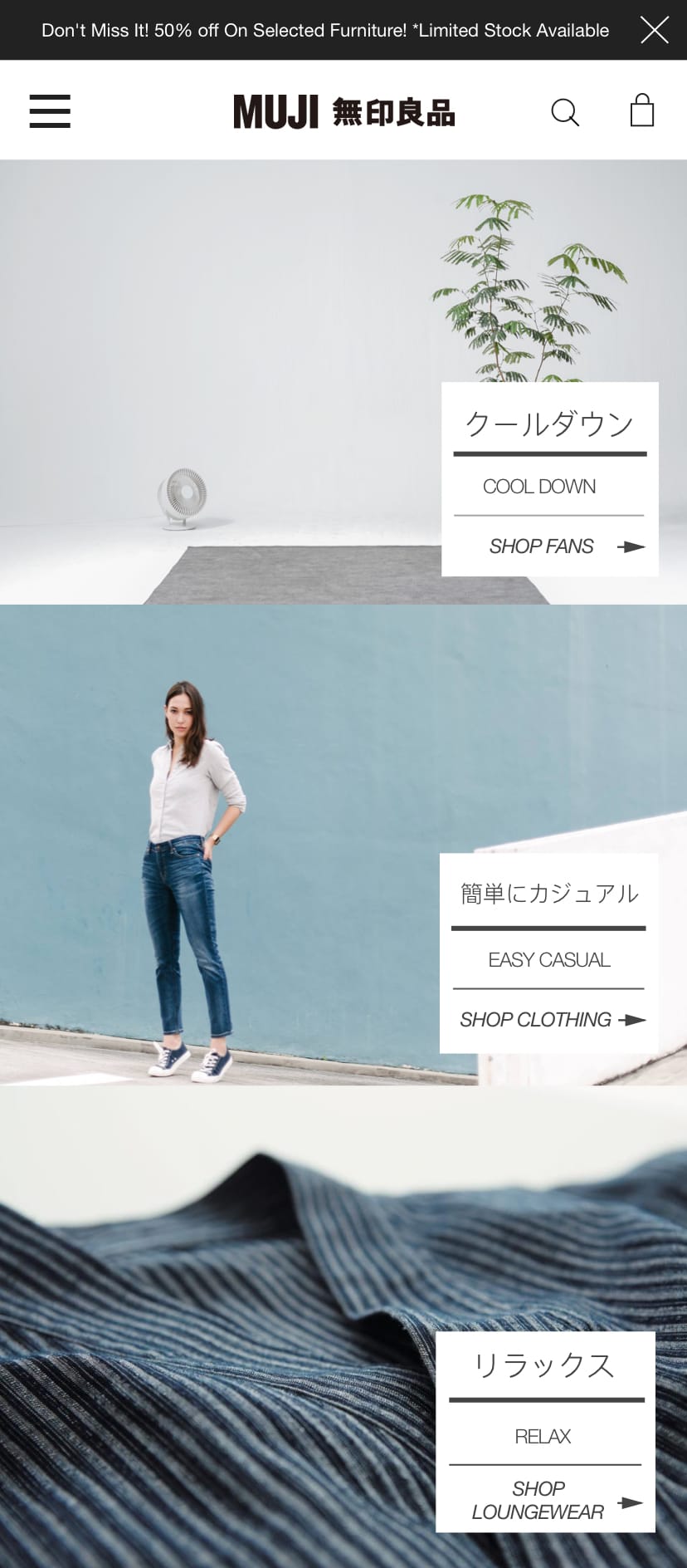
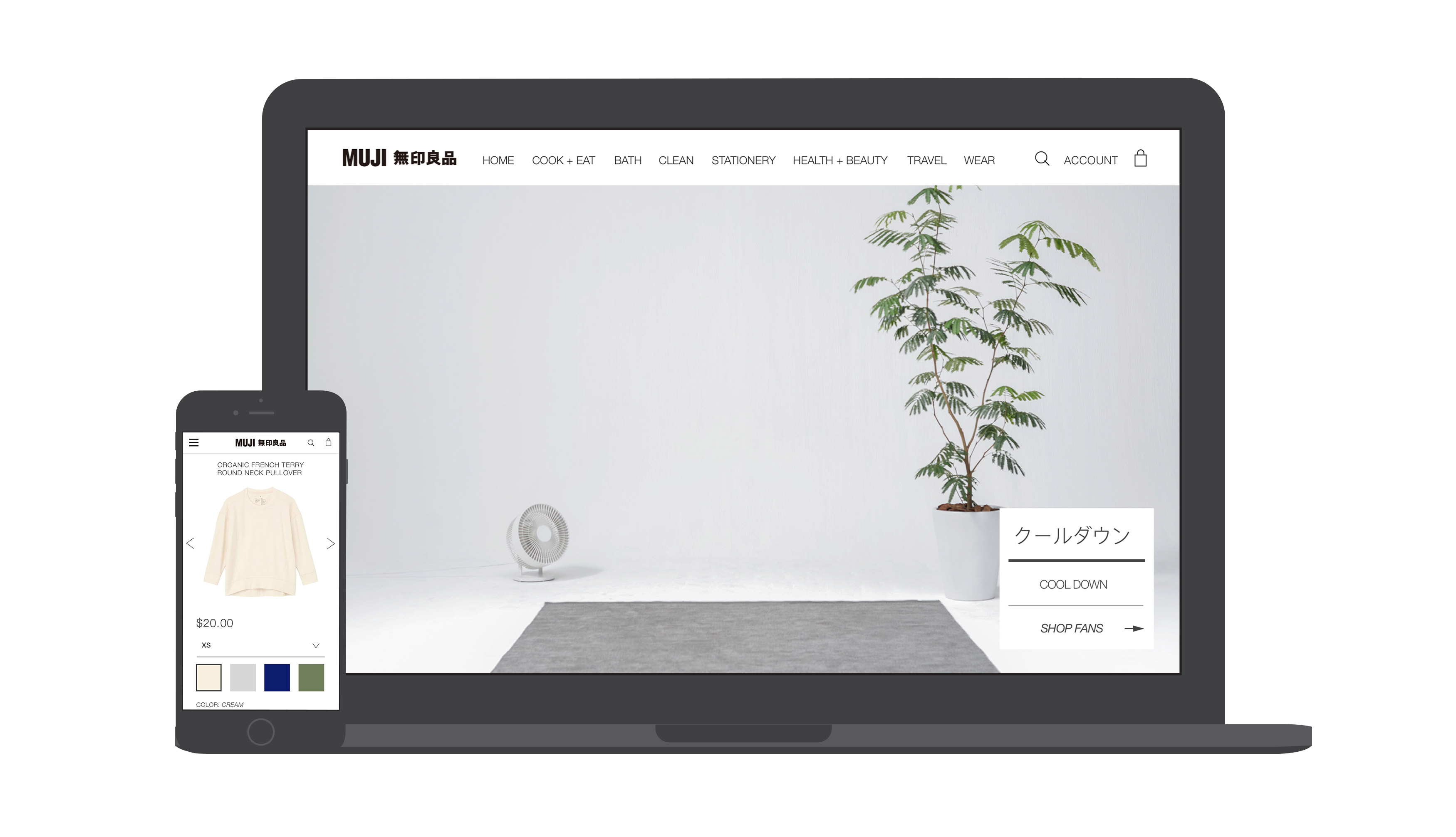
FINAL DESIGN
For this exercise, only the main pages (home, product gallery, and product details) were re-designed.
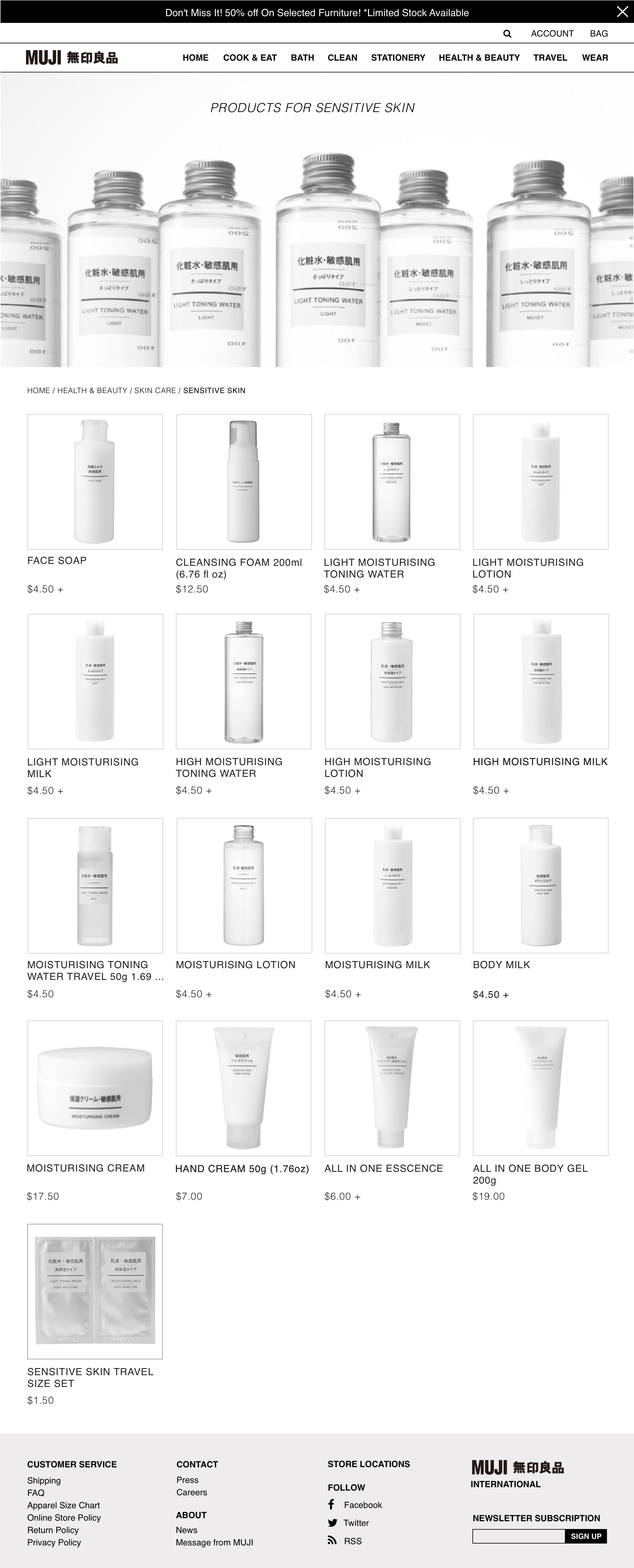
SKINCARE CATEGORY STRUCTURE AND PRODUCT EXAMPLE
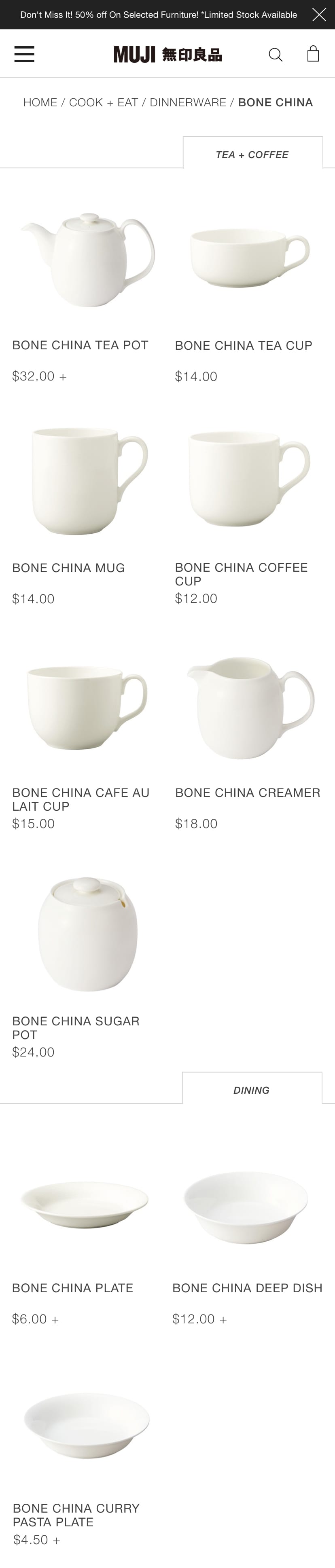
DINING & DRINK CATEGORY STRUCTURE EXAMPLE
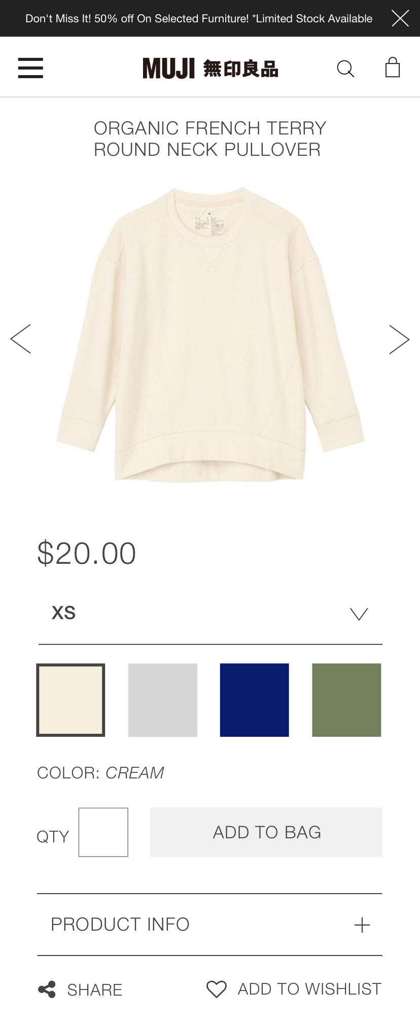
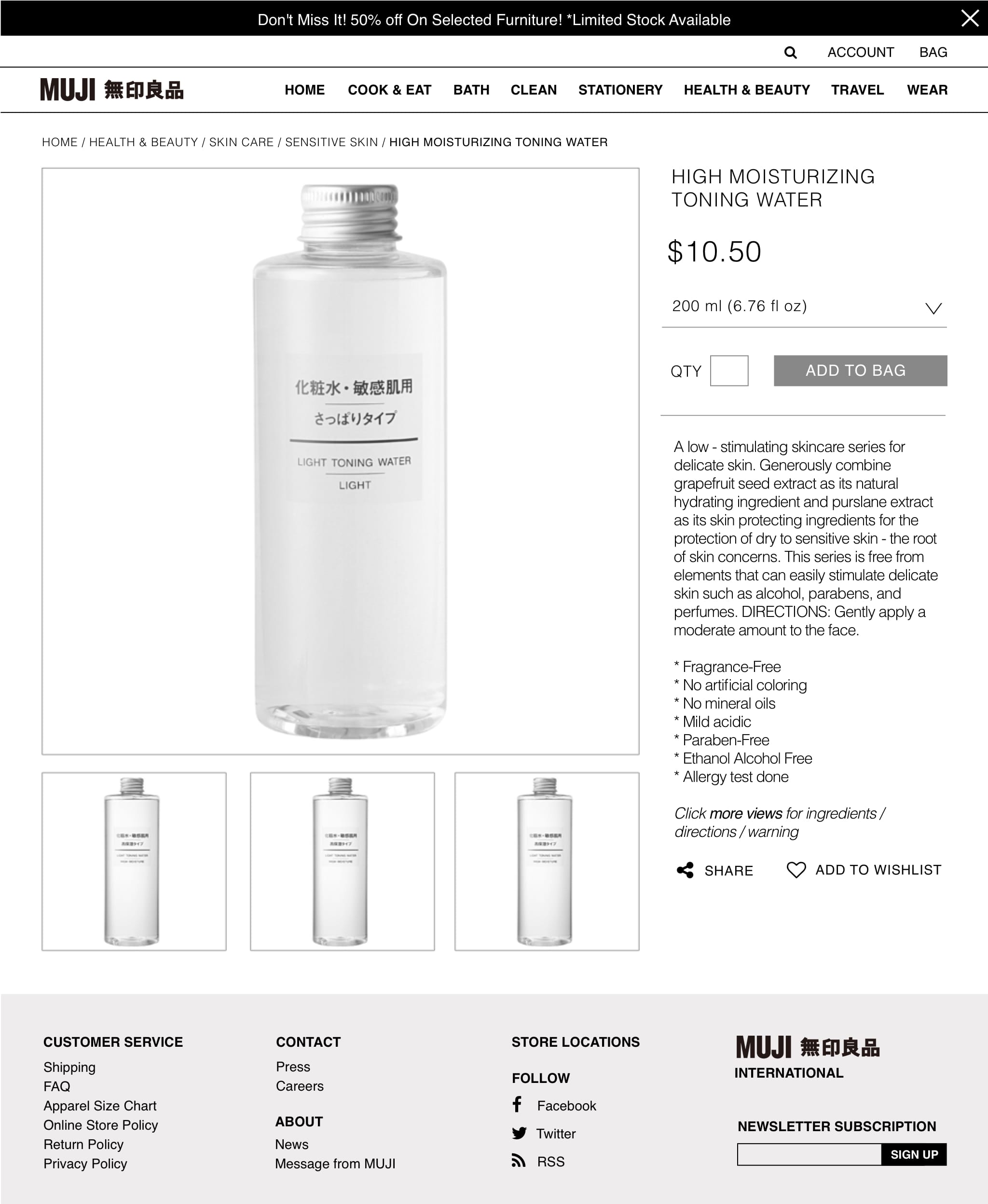
PRODUCT DETAILS – MULTIPLE COLORS EXAMPLE
MOBILE